
I've been building frontends for 13 years, and I've used a lot of open source along the way. This year I wanted to give something back. So I decided my first contribution would be small, and I'd do it properly.
I picked a combobox. It looks like the simplest component there is: an input, a list, pick one. It isn't.
Most component libraries treat accessibility as a checklist. Add role="listbox", add aria-expanded, run an automated audit, get a green tick, ship. And the result can still be unusable with a screen reader. The hard parts of a combobox aren't attributes. They're about focus, what gets announced and when, and what happens when the list changes while someone's typing.
This post goes through the decisions I made building ngx-generic-combobox, an Angular 22 component built on Signals. Most of them apply to any framework.
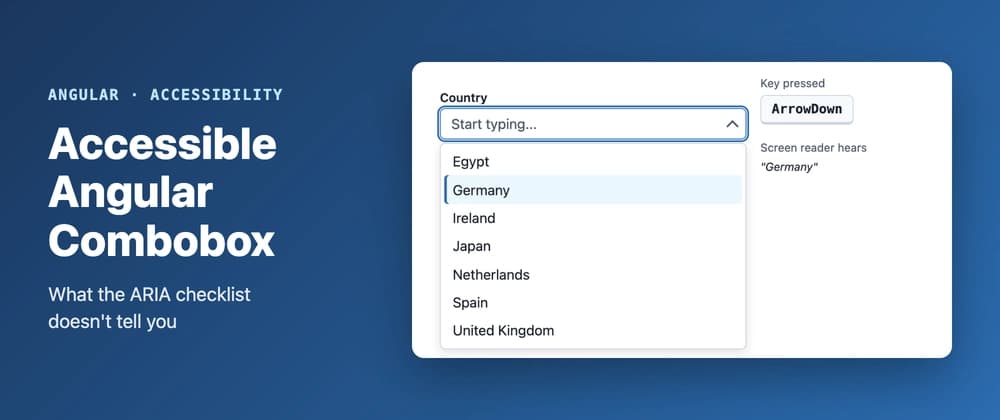
Arrow keys, Escape, filtering and Enter. The panel on the right shows what a screen reader hears. Focus never leaves the input
When a user arrows through the options, the obvious move is to put real DOM focus on each option. Screen readers are happy. But now the user can't type, because focus is no longer in the input. And typing is the whole point of a combobox.
The fix is virtual focus. DOM focus stays in the input, and aria-activedescendant tells assistive technology which option is active:
Note that role="combobox" sits on the input itself, not on a wrapper div. ARIA 1.2 moved it there so the element that has focus is the element carrying the state.
There's a detail here that's easy to miss. When nothing is active, aria-activedescendant should be absent, not an empty string:
Returning null makes Angular remove the attribute. An empty string is a reference to nothing, and some screen readers react to that by announcing nothing at all.
Virtual focus has a side effect I only found while writing a Storybook story with a long list. Because DOM focus never moves into the list, the browser never scrolls the active option into view. Arrow down far enough and you're selecting options you can't see. So an effect handles it:
block: 'nearest' scrolls the minimum needed, and does nothing when the option is already visible. Without it, the list jumps on every keypress. Announce the count, not the list
When you type into a combobox, the list filters. A sighted user sees that happen. A screen reader user gets silence.
It's polite on purpose. Reading the whole list out would interrupt the user mid-word. The count is enough to know whether to keep typing.
And the "No results" row in the list is deliberately not role="option". You can't select it, so it shouldn't be counted as an option. Small keyboard decisions that matter
None of these is big on its own. Together they're the difference between a component that works and one that's just technically compliant.
Escape does two different things. The first press closes the list and keeps what you typed. Only a second press, with the list already closed, clears the field. If one press did both, a single slip of the finger would wipe out someone's input.
Navigation stops at the ends. No wrapping from the last option back to the first. In a filtered list, wrapping makes it really easy to go past the option you wanted without noticing.