
Welcome to a new entry in my section dedicated to creating reusable and, above all, accessible components. This time, we are going to learn how to use the HTML tag to create a disclosure component without the need for JavaScript or WAI-ARIA.
Requirements to have a functional disclosure To make a disclosure accessible, a few requirements must be met: When the focus is on the disclosure element header , it must be possible to collapse and expand it by pressing the Enter or Space keys. When pressing Tab, the focus moves to the next interactive element inside the disclosure element or, if there are none, to the next interactive element on the page. When pressing Shift + Tab, the focus moves to the previous interactive element. The screen reader must announce the state of the element, that is, whether it is collapsed or expanded. It must also announce its accessible name.
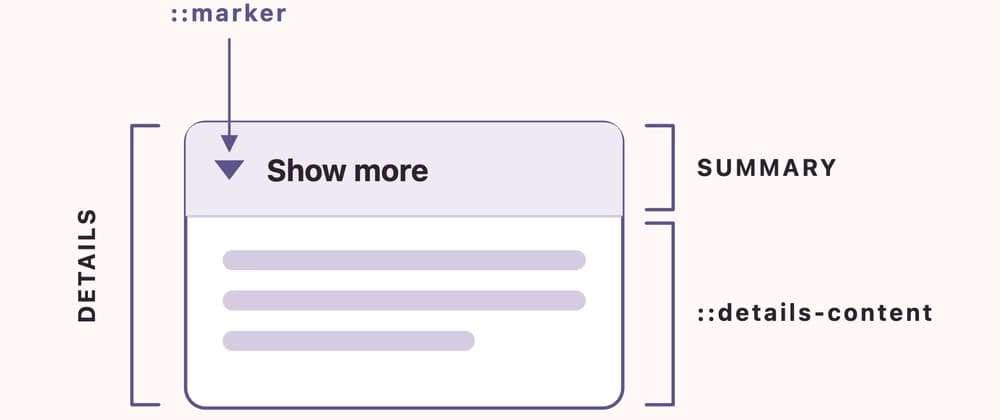
Anatomy of the details tag *: The main element that wraps the whole disclosure element. : First direct child of the tag. It is used as a header acting as the control to expand or collapse the content. There is no need to group the content of the summary inside another tag, but the following tags are valid to use: - and phrasing content. ::marker: The disclosure triangle that indicates whether the element is open or closed. ::details-content: Direct child of the tag and sibling of and it can be any valid HTML element. The best part is that there is no need to wrap the content inside a div or a fragment, natively the tag will detect it as a content.
Attributes open: This attribute indicates whether the details content is expanded or collapsed. This attribute is implicit on the tag, so there is no need to add it because the details tag is collapsed by default. If a plain open is added, the details will be expanded by default. name: This attribute will only be necessary when it is needed to manage more than one details element as a group. In other words, if one details is open and another is opened, the previously open one will automatically close.
CSS Strategies to Style The Disclosure Component How to style summary Natively, the tag comes by default with the property display: list-item. This property gives us the native the disclosure icon, which can be a triangle, a circle, only the disclosure-open or the disclosure-close icon, or use the CSS at-rule @counter-style to set a predefined list of icon styles. On the other hand, with the pseudo-element ::marker, the disclosure icon can be styled:
Cool, but now, how can the native disclosure icon be omitted? Since the tag comes by default with the property display: list-item, by simply adding a display: flex on the details > summary selector, the native disclosure icon is hidden automatically. This strategy is valid, but it is necessary to have a visual symbol that makes it explicit that this is a disclosure element. The added icon should be aria-hidden="true" because assistive technology users will already perceive the role and the state of the element.
Finally, I would like to comment that there is also another well-known pseudo-element named ::-webkit-details-marker that is used in WebKit-based browsers to style details marker. To be honest, that pseudo-selector today is not really necessary since ::marker is well supported across different browsers.
Since September 2025, we have the CSS pseudo-selector ::details-content that auto-generates a wrapper box to style the expandable/collapsible content of the tag. This is good news because now we do not need to rely on a non-semantic tag, like a div, to style the wrapper of the content and to handle the transitions from the collapsed state to the expanded and vice versa.
Expandable/Collapsible Content – CSS Snippet details::details-content, holds the styles for the collapsed default state and hides the content. details[open]::details-content, holds the styles for the expanded state. It will determine the end of the animation, if there is any. @media (prefers-reduced-motion: no-preference) {details::details-content {}}, this is an accessibility improvement! Here is where the animation between the closed and open states is going to live if the user has animations enabled in their operating system.
A correct semantic structure would be rendered as the following block of code, and you will not find any non-semantic HTML element:
Keyboard Navigation The element that receives focus and manages the interaction is summary
| Key | Action | |--------|-----| | Tab | Move focus to the disclosure element or move focus to the next disclosure element | | Shift + Tab | Move focus to the previous disclosure element or move focus to the previous interactive element | | Space or Enter | Expands/collapses the details element |
Here is how different combinations of browsers, devices and screen readers announce and interact with a disclosure element: VoiceOver macOS Tahoe 26.5.2 + Safari 26.5.2 (21624.2.5.11.8): Collapsed: 'How do screen readers announce the details tag?, collapsed, summary' Expanded: 'How do screen readers announce the details tag?, expanded, summary' Toggle state with keys combination Control + Option + Space: 'collapsed' or 'expanded' VoiceOver macOS Tahoe 26.5.2 + Chrome 150.0.7871.184: Collapsed: 'How do screen readers announce the details tag?, collapsed, disclosure triangle, group' Expanded: 'How do screen readers announce the details tag?, expanded, disclosure triangle, group' Toggle state with keys combination Control + Option + Space: if it is collapsed, the whole thing again is announced as collapsed and if it is expanded, the whole thing again is announced as expanded VoiceOver macOS Tahoe 26.5.2 + Firefox 152.0.6: same as in the combination VoiceOver macOS Tahoe 26.5.2 + Chrome 150.0.7871.184 NVDA 2026.1.1 + Chrome 150.0.7871.18: Collapsed: 'How do screen readers announce the details tag?, button, collapsed' Expanded: 'How do screen readers announce the details tag?, button, expanded' Toggle state with Enter or Space: 'collapsed' or 'expanded' NVDA 2026.1.1 + Firefox 153.0: Collapsed: 'How do screen readers announce the details tag?, button, collapsed' Expanded: 'How do screen readers announce the details tag?, button, expanded' Toggle state with Enter or Space: 'collapsed' or 'expanded' TalkBack, Pixel 10, Android 16 + Chrome 149.0.7827.160: Collapsed: 'collapsed, How do screen readers announce the details tag?, disclosure triangle' Expanded: 'expanded, How do screen readers announce the details tag?, disclosure triangle' Toggle state by double-tapping to activate: 'collapsed' or 'expanded' TalkBack, Pixel 10, Android 16 + Firefox 145.0.2: Collapsed: 'collapsed, How do screen readers announce the details tag?, button, How do screen readers announce the details tag?, Space' Expanded: 'expanded, How do screen readers announce the details tag?, button, How do screen readers announce the details tag?, Space' Toggle state by double-tapping to activate: 'collapsed' or 'expanded'
The same element powers very different UI. Here are a few patterns built with nothing but its native tags, the name attribute and the ::details-content pseudo-element, still with zero JavaScript. FAQ section: One answer open at a time. The same name attribute on every panel makes the browser close the others for you. {% codesandbox n4t52h %} Inline "read more": Keep the intro, hide the detail. display: inline on the details and ::details-content folds it into the sentence. {% codesandbox kjhxfj %} Spoiler or show solution: Hide an answer, a code solution, or a plot spoiler behind an explicit reveal. Closed, the content stays out of view and out of the accessibility tree. {% codesandbox rzdsny %} Show order details: Keep a card design that has the specifics behind a toggle. Perfect for order metadata, technical specs, or anything power-users want but everyone else can skip. {% codesandbox nc8p8v %} Animated markers: Because the open/close state is a plain CSS selector, you can animate any marker you like: a chevron that spins, a dot that turns into a ring. {% codesandbox tpl7v9 %} Collapsible filter panel: Group form controls under collapsible headers to keep a long filter rail scannable. Each group remembers its own state; the inputs inside work exactly as they would anywhere else. {% codesandbox js2fvf %} Specifications: Keep the buy box clean and file the full spec sheet behind a toggle. Shoppers who need dimensions, materials, or care instructions open it. {% codesandbox xwmdpk %} Collapsed code and logs**: The GitHub pattern: fold a long code sample, diff, or stack trace behind a summary so issues and docs stay scannable. The revealed block is a monospace panel. {% codesandbox m4d5dg %}. This use case uses the tag for the insertion of the new lines. You can read more about this tag its use here